This lab will follow a tutorial from at arcGIS online here. The tutorial will teach us how to process UAS data and classify the surface images based on certain specifications
Methods
First click on the link and open the demo map provided in the tutorial. You will be directed to open the Calculate Surface imperviousness task.This will allow you to extract three bands to distinguish surfaces. They are displayed on the fly so no new dataset is created.
Follow the instruction 1-4 and click create new layer.

 |
| Figure 1 |
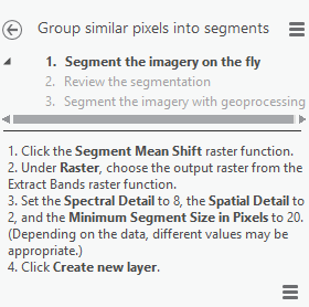
In this step we will segment the image.
First select Group Similar pixels into segments in the task bar.
Then complete steps 1-4 to create the new layer. This will create an image that looks like figure 2.
 |
| Figure 4 |
Lesson 2
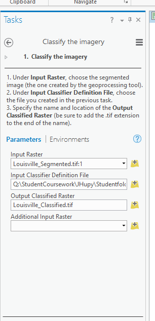
Open up the classify imagery task and open up arc map. In arcMap add both the Louisville Neighborhood and Segmented images. You will process classify this data in arcMap using the image classification toolbar. Next draw rectangles over a few houses in the north west corner.
 |
| Figure 3. Squares draw using image classification toolbar. |
 |
| Figure 4 |

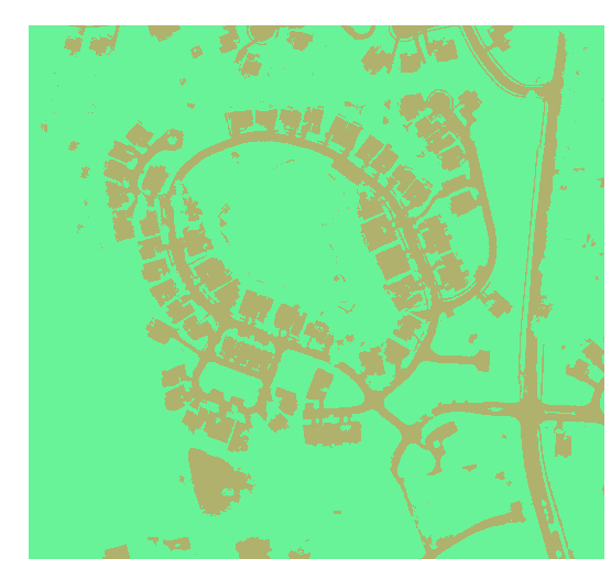
Next run the classify imagery tool following these steps yield a map like figure 5.
 |
| Figure 5 |
 |
| Figure 6 |
 |
| Figure 7 |
 |
| Figure 8 |
This data produced a map that shows areas that have the highest area of impervious surfaces in darker colors. This happens to be areas of roads. This can help city planners determine storm water fees based on areas of lower impervious surfaces. If we have our own similarly accurate data we can go about the same process to classify the image using our own specifications.
No comments:
Post a Comment